Role
Product Designer
Outdoorsy is the world's largest RV rental marketplace. As Product Designer on the mobile squad in 2019–2020, I rebuilt the listing-to-checkout flow, introduced a "trip confidence" pattern that re-shaped how hosts and renters negotiate, and shipped meaningful lift to mobile revenue and conversion.
The brief. Mobile traffic was 64% of sessions and 31% of revenue. The funnel had a leak in the middle — people would research like crazy on phones, then bail or finish on desktop. We wanted them to finish on the phone.
The deeper truth: renting an RV is a high-trust transaction. The customer is sending several thousand dollars to a stranger to use a vehicle they own. On the phone, in the dark, while their kid is asleep next to them. Every fact they don't have feels like a risk.
Listing. Photos were beautiful but the deal-breaker info — towing, mileage, what's-included — was four scrolls down. People made yes/no decisions on a hunch.
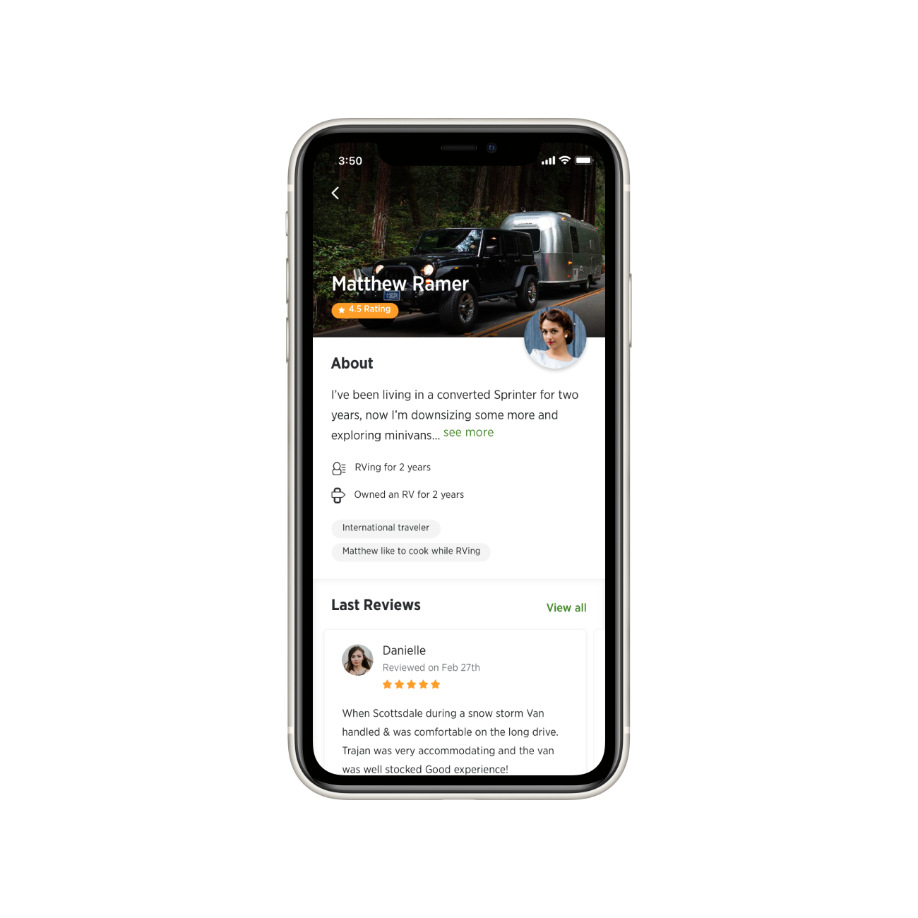
Inquiry. Hosts took 6–18 hours to respond. The renter had no idea what a normal response time was, so silence read as rejection.
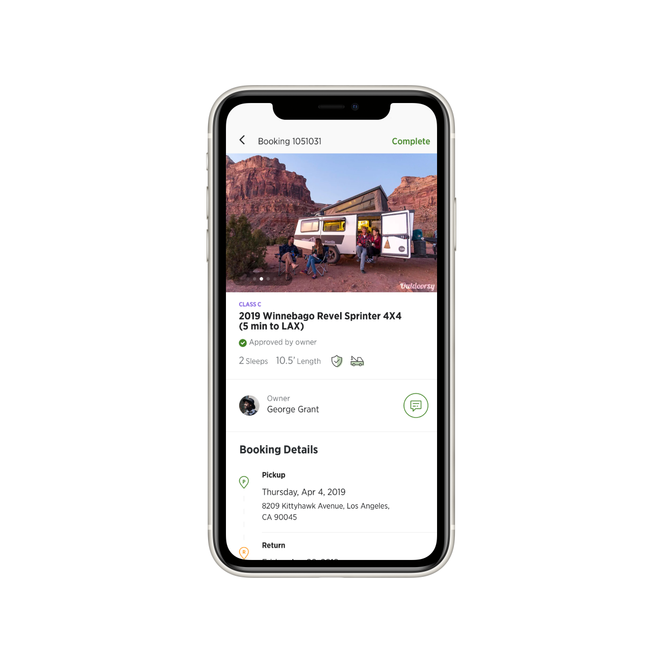
Checkout. A six-step form on a phone. Three of those steps existed mostly for legal reasons we never explained.
I shadowed twelve renters and six hosts, half of them in person. The throughline was confidence — every drop-off corresponded to a fact the user couldn't get fast enough.
So we re-mapped the journey as three confidence moments: "this is the right rig," "this person will actually reply," "this booking is real." Every screen got a job in service of one of those.
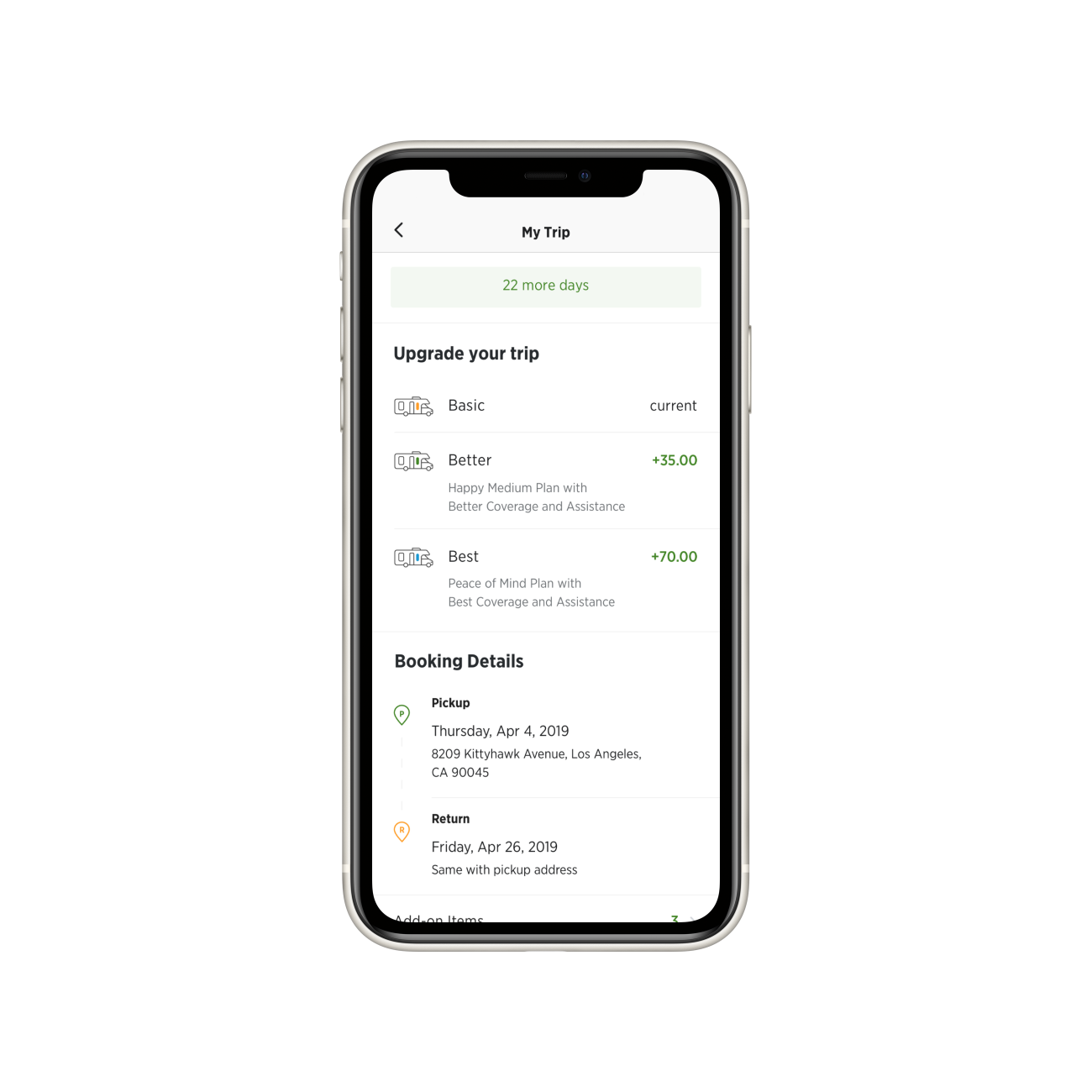
The signature pattern — what the team came to call the Trip Confidence card — pulled hosting policy, response-time SLA, and trip protections into one persistent stripe at the top of every booking screen. Renters stopped asking the questions because the answers were already there.
Twelve renter sessions, six host sessions, three weeks of session replay. Mapped the funnel by confidence event, not by screen.
One pattern, deployed across listing → inquiry → checkout. Each instance configured to that screen's specific anxiety. Tested in 18 unmoderated sessions.
Six steps to three. Two of the removed steps moved into a "we'll confirm" post-payment sequence that eased legal copy without hiding it.
Designed a host-side notification system that taught hosts what an "industry good" response time looked like. Median host reply went from 11h to 2h 40m.
The deal-breaker info — towing, mileage, what's-included — moved up, and the Trip Confidence card put hosting policy, protections and response time into one persistent stripe. Renters stopped asking because the answers were already there.
The inquiry composer now shows a typical-reply time, so silence stops reading as rejection. Host-side coaching pulled median reply time from 11h to 2h 40m.
A clear summary, the Trip Confidence card once more, and the two legal steps moved into a "we'll confirm" post-payment sequence — easing the copy without hiding it.
"What distinguishes Akif is his ability to connect user-experience decisions with measurable business outcomes. His contributions were not incremental — they were foundational to our growth and long-term scalability."